In this text, you will see how you can create a navigation menu in the style of an application, i.e. the same look and shape as used by various mobile applications or e.g. like Instagram that uses. We will create such a menu on the responsive version of the site for mobile with the help of Elementor.
Navigation menu
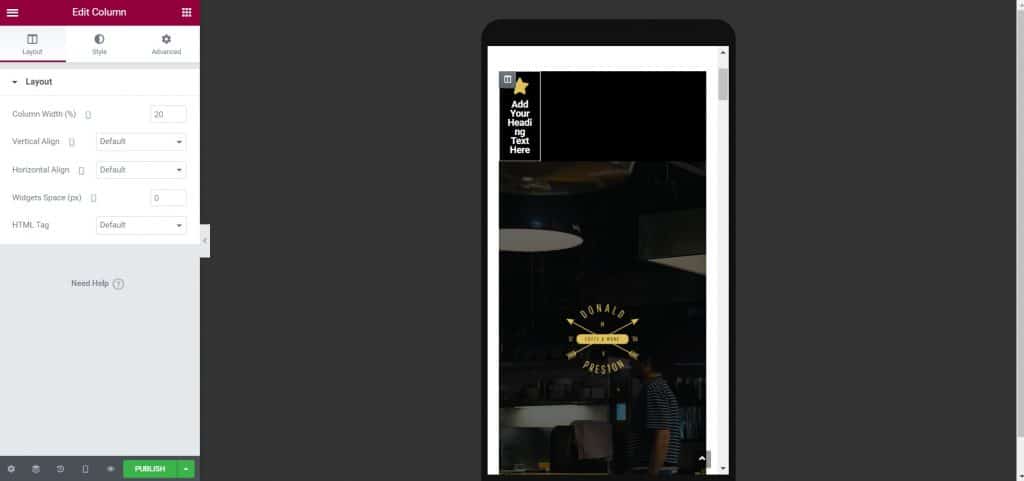
The first thing to do is to add a plain section. Next, add a title and an icon above the title and center them. In order for it to look good on mobile, with prior experimentation, it is necessary to set the size of the icon to 25 and the title to 11, specifically in this case, and depending on the theme, change the color to fit in with the rest of the site. After that, adjust the distance between the icon and the text so that it is not too large, that is, in the section under the option Widgets Space(px) it is necessary to set 0 in the option code Column Width (%) set 20, if you will have 5 menu items.

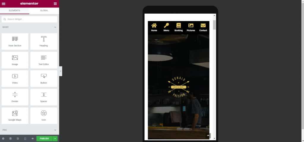
After that, you can copy the section 5 times or as many times as you need and then just change the icons and the text below the icon depending on your menu. You can choose icons from the library or add your own, feel free to play with it, and the menu should look like this at this point.

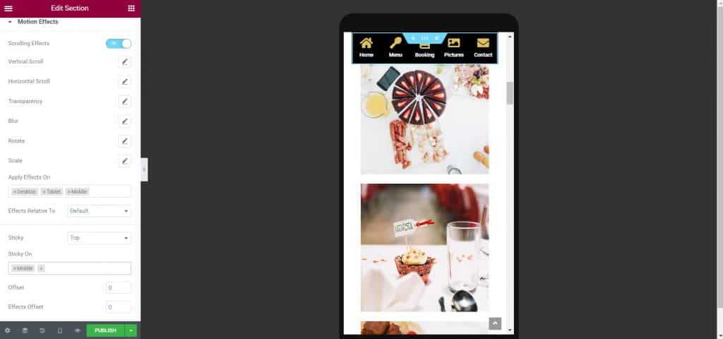
And there, you have created a navigation menu similar to applications, now you just need to drop it to the bottom of the site and fix it in that place so that it does not move. If you want to fix the menu at the top of the page and see it all the time while scrolling the page, you need to do the following. When setting the section, turn on the switch Scrolling Effects and option code Sticky leave it on for mobile only, if that's your goal.

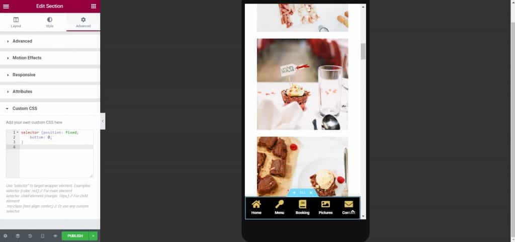
In order to fix the navigation menu at the bottom of the site, you cannot do it like this, but in the following way. You need to add the 2 lines of code under the Custom CSS section that you'll see in the image below, and before doing that you need to increase the Z-index to say 10, so that your menu doesn't disappear. Also, it is necessary to expand the section so that the menu is the entire width of the page, and this is achieved by turning on the switch at the option Layout called Stretch Section. As you will see in the image below, the menu has moved to the bottom of the page.

I hope that this text was useful for you and that you learned something new, if you are interested in reading more tips for independent work, you can check them out on our blog, and in case you want to consult with professionals, click on this one Link.
Source: youtube


