Marketing has always been closely related to psychology. Whether it's your website, Instagram account or any other platform where you promote a product or service - your goal is to attract attention. Once a user, accidentally or intentionally, finds himself on your platform, by distinguishing him from the competition, you turn him into a loyal customer.
In the ocean of diverse content and short attention span of users, the strongest in their business have opted for the proven best method when it comes to creating a lasting brand - psychology.
We have already written about its crucial importance on this blog Digital Psychology: The Key Secret to Success in Modern Marketing - Tourmaline, but now we will focus on the field of visual psychology, where we will deal with what impact visual presentation has on what you present.
What is visual perception?
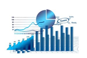
According to research, the human brain processes visual information 60,000 times faster than text. Also, visual information is remembered better than words, which has been proven by a study that people remember 80% of what they see and do vs. 20% of what they read. Based on the facts presented, it is clear that incorporating visual media into your marketing strategy can help you capture the attention of your audience and leave a lasting impression.
This advanced visual marketing is a method that is proven to connect you with your customers on an emotional level. According to leading marketing research, we are attracted to certain patterns, shapes, colors, position and other key details to which the brain has instinctive reactions.
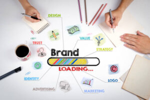
Visual marketing is an approach that has gained a significant role in recent years, which includes the use of images, videos, graphics, and other visual elements to communicate with customers.

What is the importance of visual presentation for your platform?
That visual marketing is undoubtedly the most effective form of content marketing, confirmed by 37% companies from the field of trade. A study conducted by Stanford University concludes that there is something in our brain called "visual perception". Using this sense, the brain explores the environment and makes decisions based on past experiences of the same environment. Therefore, it is important to understand that visual presentation must be used in an effective way, in order to avoid sending an unwanted message to the target audience.
Visual content is at the top of marketing trends for companies today. The consequences of the pandemic have caused it to spread even more. Due to the flood of content, you have a small window of time to grab the user's attention. The best sites subtly persuade the user to explore and participate.
This tool penetrates deeper, because it enters the realm of human psychology, trying to understand how our mind works, what captures our attention and what keeps us occupied. But the most successful web designs are those that stand out from the competition, leveraging their understanding of the minds of their visitors.
With this method, digital marketing veterans know how the mind processes certain colors, designs, layouts, and shapes, and how cognitive biases can be leveraged to increase user engagement.

How to implement these tools in your marketing strategy?
The only thing that matters for your platform is the visitors. Your design of that platform can be someone's first and last contact with your brand. If you do everything right, the very first experience can turn a visitor into a loyal user.
What motivates us to make a certain decision? Which functionalities are confusing? Is your design compelling enough to keep the visitor interested? Leading websites elicit action from users because they rely on intuitive design.
These are five key web elements to influence user behavior:
1. Colors
The psychology of color, when it comes to any platform, is the basis of your brand design. What is the role of colors is also shown by the fact that they can increase up to 80% the recognition of your brand. They are a powerful tool that influences our emotions, behavior and decision-making.
We associate certain emotions with certain colors, and by using a carefully chosen color we send a message about the overall impression of the brand. That way, we also use them to highlight important information, a call-to-action button, or put focus on a special message.
These are some of the basic colors and the emotions they represent:

Depending on your brand identity and the nature of your business, you should carefully choose the color palette you will use. Those colors are the door through which visitors experience your brand and create an emotional reaction. By combining color harmonies, the layout becomes more eye-catching and the text easier to read.
How to choose colors? Color theory is a science whose focus is the mutual interaction of colors on the wheel itself. Four recognizable and widely accepted structures for creating color schemes are the following:
Monochrome which includes only one color in all its different variations; Complementary which includes 2 colors which are opposite each other on the color wheel; Analog which includes 3 colors which are next to each other on the wheel, i Triad which also includes 3 colors which are equally separated from each other, in the shape of a triangle.

2. Spacing - utilization of space
A design cluttered with information and elements often overwhelms the visitor, making it harder for them to focus or find what they are looking for. In contrast, "white" or "negative" space acts as a visual resort for the eyes in a layout. White (negative) space is the portion of the layout that is "empty". This is the space between your main visuals, lines of text and margins.
White space has the role of directing attention to specific content, making certain aspects stand out over others. Furthermore, good use of white space significantly enhances overall readability, and provides a pleasant user experience.
In designing layouts, white space can be a powerful ally. It can contribute to a polished aesthetic that allows the content to stand out. You can rely on this empty space to maintain the impression of a clean and modern surface.
But it can also be part of a larger picture or color, if done with style. If placed well, it directs attention to the information you want to be in focus.

3. Layout
Layout is the process of placing and organizing visual elements on a page to convey a specific message. If the arrangement of these elements is difficult to follow, then the design falls into the background, no matter how visually appealing it is.
Layout design shapes the overall look and relationship between graphic elements to ensure a smooth message transfer, improving performance and easier navigation through the site. Think of assembling puzzles as graphic pieces until they become a work of art.
Certainly, beauty is not enough; Your design must be user friendly, unique and intuitive. In web design, layout is the backbone of the entire structure, facilitating the experience and rewarding satisfied users.

Tips for designing a layout:
- The goal is to make it as simple and clear as possible, in order to avoid the accumulation of content, and to emphasize the crucial elements.
- Use white space to create a clean layout for easy and quick reading, thereby reducing the visitor's overload to process information
- Highlight important information using white space, a different color, font or shape
- Maintain the consistency of your style throughout the site, so that it represents a unified whole
- Upload high-resolution images and videos
- Organize related elements next to each other or together to make navigation and navigation more efficient
- By using visual hierarchy, you dictate that elements of greater importance be more dominant and more easily noticed
- Increase the readability of the content by making the text shorter and to the point, for easier understanding and absorption

4. Typography
Typography deals with creative design with the help of arranging letters and text. It whispers about the character of your brand, and with a good choice of font, size and color, it brings a new experience to the surface.
Colors, spacing and size should be used carefully to draw attention to the important parts. And when it comes to choosing a font, you don't want to go overboard with the number of different fonts. Two to three are quite enough to attract the eye and remain simple to understand.
What is most important is that the choice of font, color, size and background does not negatively affect the experience of reading the text.
Try to inform with as little textual content as possible, focusing on the essence. The positioning of the text in the layout and the spacing between lines of text should be carefully planned, as well as the choice of font, so that the harmony of these elements results in smooth reading.
There are 5 different categories of fonts that you can use in your visual content. Each of these categories evokes different types of emotions, and is associated with different aspects of the brand.
First category fonts is Sheriff, which includes Garamond, Times New Roman, Baskervilles, Georgia and Bodoni. Fonts in this category are associated with respect, tradition, grandeur and authority. Serif fonts should be used for editorial content.
Next category fonts is Sans Serif and the fonts within it are associated with modern, objective, stable and universal brands. They are under this category Arial, Helvetica, Calibre, Century Gothic and Verdana. You can use these fonts if you want to emphasize a word or in the text of your header.
Third category fonts is Slab Serif, and these include Courier, Museum, Bevan, Rockwell and Clarendon. These fonts are used to make a strong, bold, modern and strong impression. This font category can be used for general attention grabbing.
Fourth category is Script fonts, and there are Brush Script, Zapfino, Lobster, Lucid and Pacific. These fonts are associated with aspects of feminism, creativity, intrigue and elegance. These fonts should be avoided by corporate brands, while creative ones can use them.
The last, fifth category is Modern fonts, in which they are located Eurostyle, Marjoram, Politics, Matchbook, and Infinity. These fonts are associated with modernity, intelligence, sharpness, style and exclusivity. Also, it is effective on social platforms and among millennials.
5. Geometric shapes
Another plus when creating your visuals is the use of geometric shapes. For centuries, shapes like circles, squares and triangles have evoked our reactions through their meaning. By understanding how our mind automatically registers basic shapes, we can capture ideas faster than words.
Shapes have had different symbolic meanings throughout time, different cultures and contexts. However, there are lasting impressions that remain universal that designers can capitalize on.

Circles they feel inclusive, integral, spiritual. They naturally draw us to a central focus. Circles and other oval shapes can be embedded in any area of the page: whether it's a logo, an icon, a call-to-action button, or a thumbnail. They represent movement, infinity and harmony because they are smooth and have no sharp corners. Symbolic meanings: harmony, unity, infinity, cycles, movement, flow, community, relationships, wholeness, perfection.
Solid, right angles and parallel lines square and rectangle they evoke built structures and environments. They convey grounding, direction and proportion. Squares and rectangles are the most commonly used shapes in web design, especially as a foundation or framework to simplify complex web designs. They are mainly used to organize elements and information within the page. They evoke a feeling of balance, reliability and security. They are usually used for navigation menus and call-to-action buttons. Symbolic meanings: stability, order, strength, reliability, professionalism, pragmatism, integrity, balance.
Triangles they direct attention with their dynamic shape. They can appear energetic or aggressive depending on the orientation. They suggest hierarchy when displayed stacked. Triangles are strong geometric shapes that indicate movement and direction, and are used to direct the viewer to a specific area of the page. They can convey opposite meanings, depending on their position. If the triangle is facing up, it conveys strength, stability and energy. But when facing down, it becomes unstable and can convey tension or conflict. Symbolic meanings: energy, action, tension, science, law, religion, hierarchy, power, structural stability.
Spirals are intrinsically dynamic, drawing the eye along a twisting path. They reflect the generative processes in nature, from spiral galaxies to nautilus shells. Symbolic meanings: growth, expansion, progress, journey, evolution, transformation, creativity, imagination, natural processes.
Wavy and curved lines they avoid rigidity, which implies fluidity and irregularity. They can appear carefree but also emotionally sensitive. Circles soften sharp curves. Curves add a sense of fluidity to the page design, making the viewer feel calm and relaxed. Because the curves are smooth and fluid, they help encourage viewers to explore the page without straining the eyes. Designers can use curves to make the surface look more elegant and contemporary. Symbolic meanings: water, flexibility, changeability, lightness, grace, moodiness, intuition, emotion, freedom, independence.
Why is using a visual presentation the right choice?
We come to the conclusion that visual presentation in digital marketing and web design has become a dominant form of communication.
With it, the textual content did not lose its quality, but was completed with a new dimension - visual, which captures the visitor's attention in a more intensive way.
Let's adapt to the new digital era, where the effect of this type of marketing is more visible every day, because the fruits of emotional involvement reward a larger number of loyal clients.
Sources: How To Use The Psychology Of Web Design To Influence User Behavior | CXL,
Psychology Of Shapes In Design With Theories And Principles (digitalarcane.com),
Color Theory In Web Design: A Complete Guide (2024) (elementor.com),
The Psychology of Visual Marketing: Using Color and Design to Influence Audience - AdLift ,
If you're ready to push the boundaries, let us know!
Write to us by email: info@turmalin.rs
or
Call the number for Serbia: +381 64 297 48 22
Call the number for Bosnia and Herzegovina: +387 65 150 618
Turmalin tim 🙂